

Type-safe
Styling Engine for Design Systems
Author design tokens, themes, utilities, and component recipes in TypeScript and compile them to zero-runtime CSS and type declarations. Catch a renamed token before your users do.
styleframe.config.ts
import { styleframe } from 'styleframe';
import { useDesignTokensPreset, useGlobalPreset, useModifiersPreset, useSanitizePreset, useUtilitiesPreset, useButtonRecipe } from '@styleframe/theme';

const s = styleframe();

useDesignTokensPreset(s, {
  colors: {
    primary: '#0066ff',
    secondary: '#7c3aed'
  }
});
useSanitizePreset(s);
useGlobalPreset(s);
useUtilitiesPreset(s);
useModifiersPreset(s);

useButtonRecipe(s);

export default s;
Your whole design system, from one config
Tokens, themes, utilities, and component recipes come from a single TypeScript source. Change a token once, and it flows to every selector, theme, and recipe that references it.
Compose your system from existing parts
Assemble your design system out of composables you already have. Plug and play variables, selectors, variants, and utilities — colors from one theme, typography from another, all resolving through one source.
Infinitely Customizable
Make your design system your own. Start from the default theme and customize every token to fit your needs.
Mix and Match Composables
Colors from one theme, typography from another. Styleframe lets you combine composables seamlessly.
styleframe.config.ts
import { styleframe } from 'styleframe';
import { useColorDesignTokens } from '@styleframe/theme';
import { useTypographyDesignTokens, useSpacingDesignTokens } from '@orgname/theme-minimal';
import { useComponents } from './my-components';

const s = styleframe();

// Colors from the default theme
useColorDesignTokens(s, {
    primary: '#318fa0',
    secondary: '#ff6b6b'
});

// Typography and spacing from another theme
useTypographyDesignTokens(s);
useSpacingDesignTokens(s);

// Plus your custom components
useComponents(s);

export default s;
One source, every theme
Light, dark, and custom themes come from the same token source. Defining a theme is as easy as declaring a variable — no separate stylesheet to keep in sync.
styleframe.config.ts
import { styleframe } from 'styleframe';

const s = styleframe();
const { variable, ref, selector, theme } = s;

const surface = variable('color.surface', '#ffffff');
const text = variable('color.text', '#18181b');

selector('.card', {
    background: ref(surface),
    color: ref(text),
});

// Every theme reuses the same tokens — just override their values
theme('dark', (ctx) => {
    ctx.variable(surface, '#18181b');
    ctx.variable(text, '#ffffff');
});

export default s;
Zero-Runtime by Default, Dynamic When You Need It
The engine compiles your system to static CSS at build time for maximum performance. When you need prop-based styling, an optional runtime handles Recipes.
Static Generation
CSS is generated at build time, resulting in zero runtime overhead for your base styles.
Output
/* Static CSS generated at build time */
.button {
    background-color: var(--color--primary);
    padding: var(--spacing);
}
/* Optional runtime for prop-based Recipes */
recipe({
    name: 'button',
    base: { background: '@color.primary' },
    variants: {
        size: {
            sm: { padding: '@spacing.sm' },
            md: { padding: '@spacing.md' },
            lg: { padding: '@spacing.lg' },
        },
    },
    defaultVariants: { size: 'md' },
});
Write Markup, Skip the CSS
The engine reaches into your markup. Our Utility Scanner is like Tailwind JIT, but type-safe and built on your own design system — write utility classes directly in your markup, and the scanner detects them and generates only the CSS you actually use at build time. Zero waste.
Automatic Detection & Generation
Use utility classes in your markup without pre-defining every value. The scanner matches class names against registered factories, resolves design tokens, and generates the CSS.
Framework Agnostic
Built-in extractors for HTML, Vue, React, Svelte, Astro, MDX, and more. Add custom extractors for any file type.
Component
<!-- Write utility classes in your markup -->
<div class="_padding:lg _display:flex _gap:[1rem]">
    <button class="_background:primary _hover:background:secondary _padding:md">
        Click me
    </button>
</div>
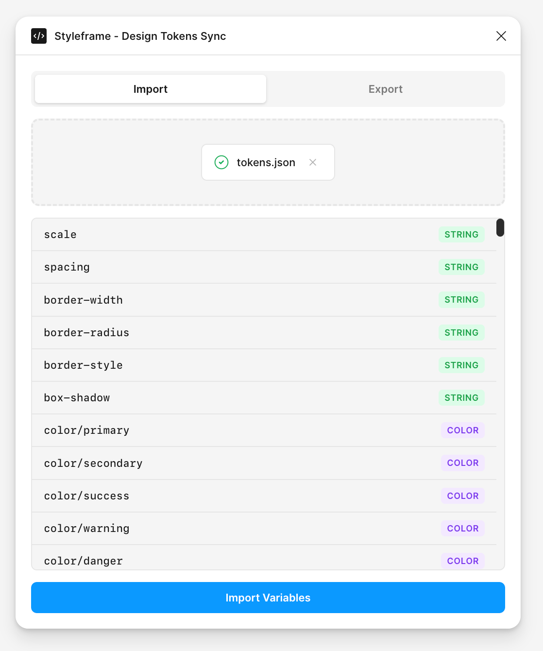
Sync Design Tokens with Figma
The engine reaches into your design tool too. Export your Styleframe design tokens to the W3C DTCG format and import them into Figma. Keep your code and design files in perfect sync with full multi-mode support for light and dark themes.
Bidirectional Sync
Import tokens into Figma or export Figma Variables back to JSON. Both directions preserve structure, aliases, and semantics.
Multi-Mode Support
Light, dark, and custom themes are preserved as Figma modes. Your theme structure stays intact across every sync.
Coming Soon
AI that Writes Type-safe Composable CSS
Use styleframe for Agents. Choose from a variety of AI agents and start delegating work, from code generation to other technical tasks.
Fluid Responsive Design - styleframe Pro
Typography that flows naturally across every screen size
Say goodbye to cluttered breakpoint logic. Styleframe's fluid responsive design automatically scales your typography and spacing using mathematical precision.
Step 1
Define your minimum scale for mobile viewports
Step 2
Set your maximum scale for desktop displays
Step 3
Watch as everything scales fluidly in between
Interactive Controls
992px Laptop
320px1440px
MobileTabletLaptopDesktop